The Journal
A collection of thoughtful posts, practical resources, and creative inspiration. From behind-the-scenes looks at recent projects to helpful tips on branding, websites, and running a small creative business - you’ll find it all here.
There’s a particular kind of creative business that flies under the radar for a while — quietly building something beautiful, cultivating a real clientele, developing a point of view that’s entirely their own. And then one day, they look up and realize their brand hasn’t kept pace with any of it. That’s exactly where Desro […]
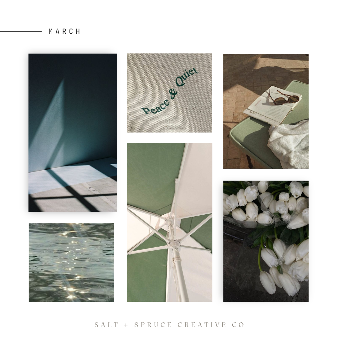
“That dream was planted in your heart for a reason.” Image Credits (left to right): Voices of Industry – Chelsea Williams – Emma Rose – We Heart It – Sean Woolsey Studio – Eflor. Color Mood
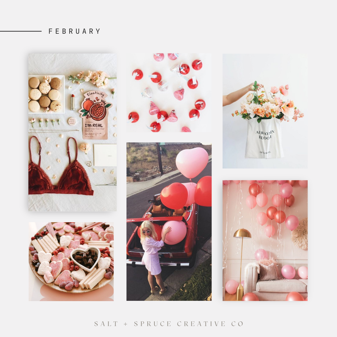
February Mood Board “Be patient – you were brought to this place for a reason — there’s more happening behind the scences than you can see.” – Lindsey Eryn – Image Credits (left to right): Sarah Michiko – Style Me Pretty – Afloral – TheMamaNotes – La Petite Noob
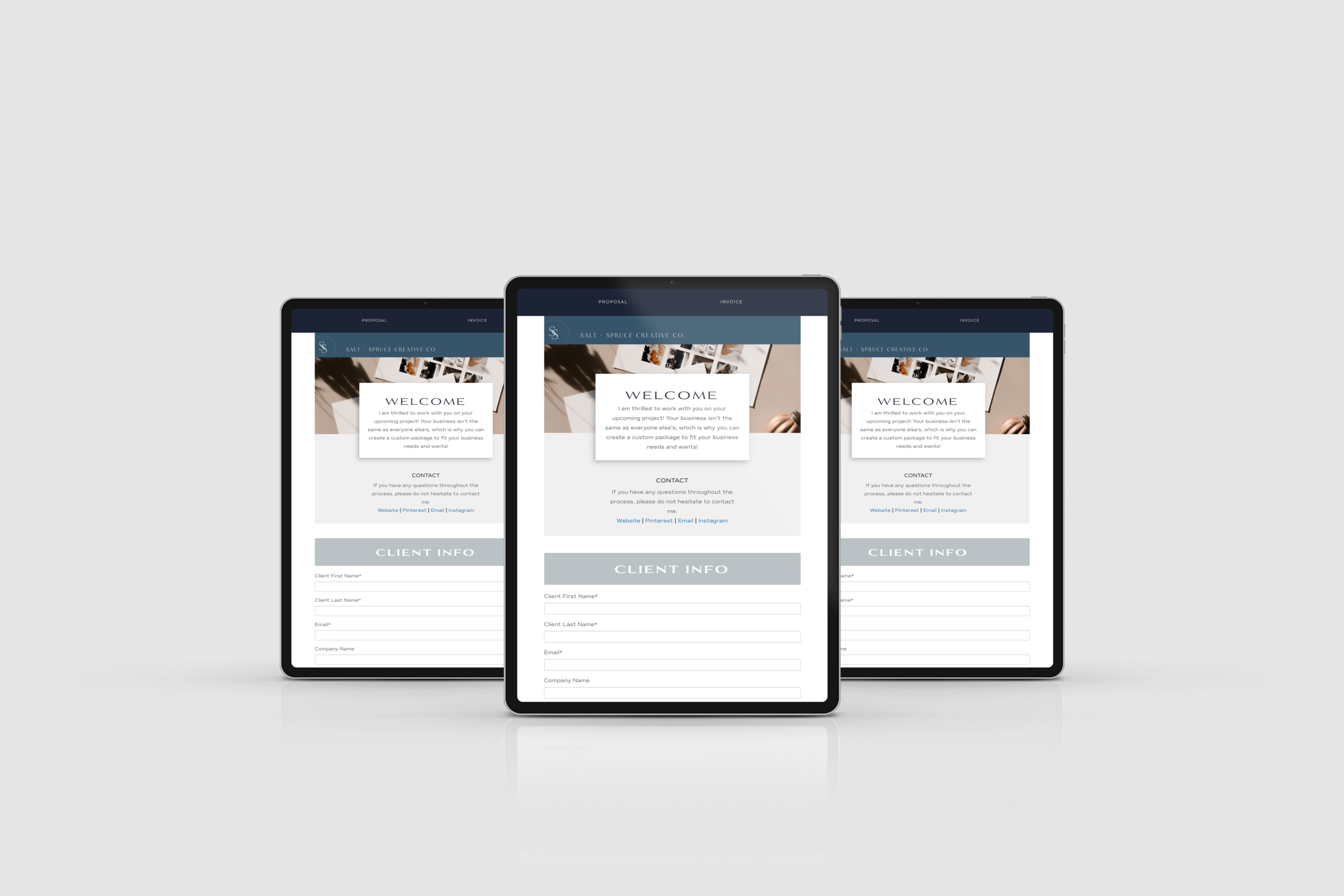
Dubsado is a great CRM tool that I have been using for years. Dubsado handles all my invoicing, forms, and contracts, and I love that I can customize each form and questionnaire to match my brand.
Obviously, I’m obsessed with branding and keeping everything consistent, and customizing your forms is a simple way to elevate your brand.
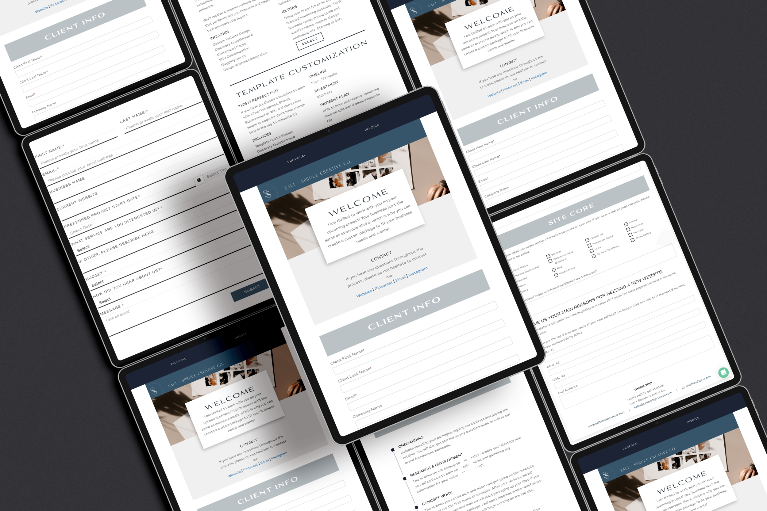
Dubsado is a powerful CRM for photographers and creative service providers, but its default forms don’t always reflect a polished brand experience. In this post, we’re walking through how to customize your Dubsado forms so they feel cohesive, on-brand, and aligned with the client experience you’re building. Please note: this is my take on it […]
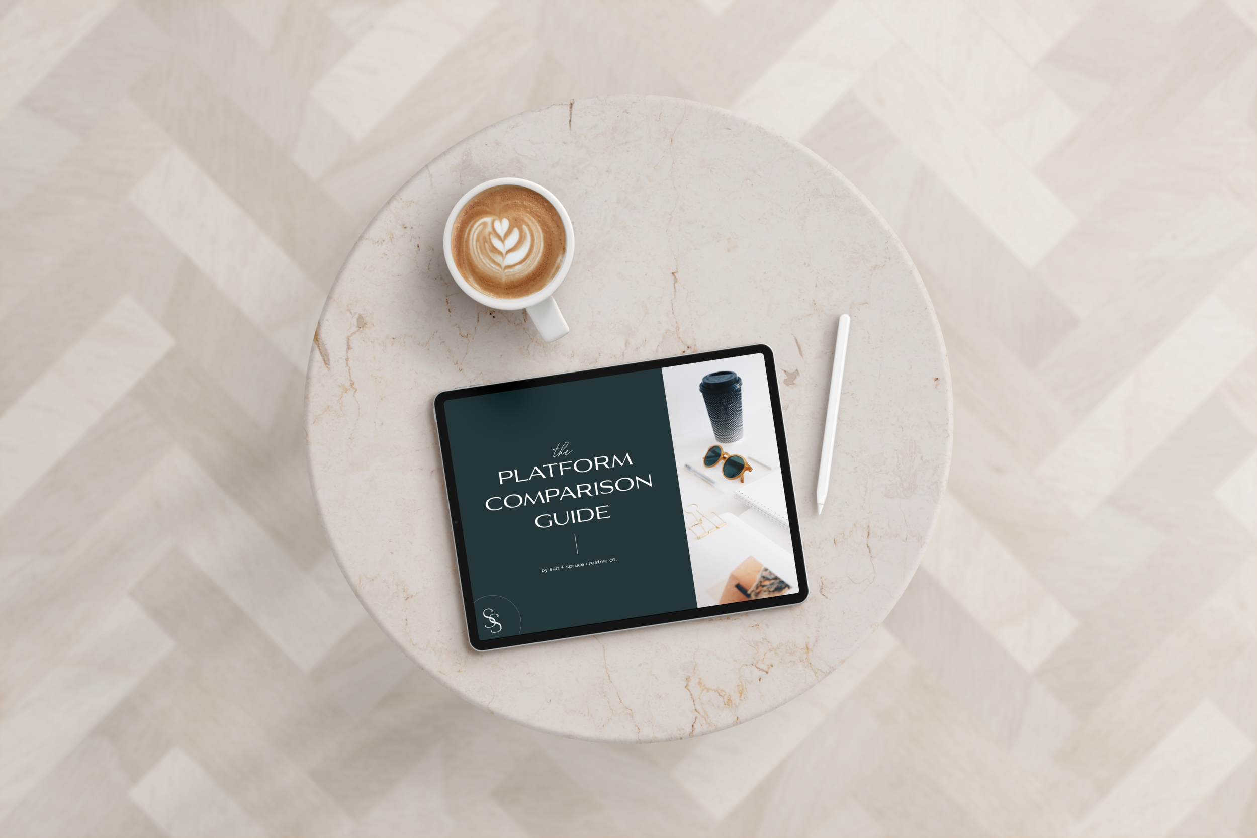
Deciding on your platform for your website is one of the hardest choices I feel like business owners can make. You’ve decided you need an online presence, but which one?! Why are there so many options?!
That’s where I come in! I’ve narrowed it down to my top three recommendations – Showit, Squarespace, and Flothemes with Wordpress.
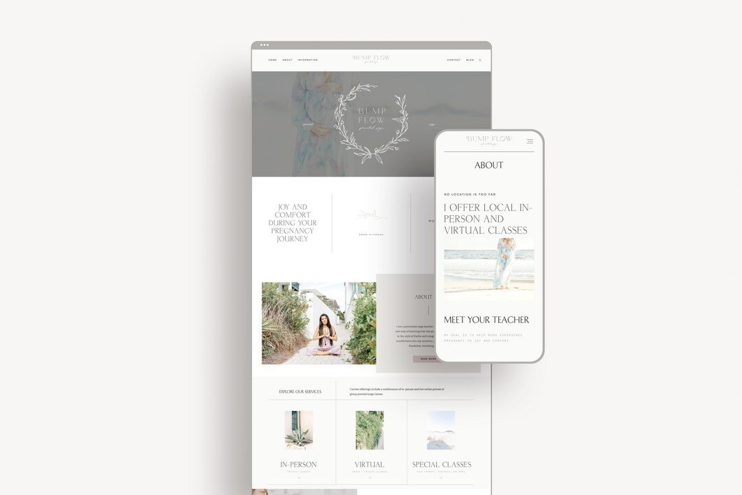
PROJECT OVERVIEW Brand and custom web design for Bump Flow – a prenatal yoga studio based in Destin, Florida. INDUSTRY Yoga Studio WORK COMPLETED Brand Design & Website Design Color Palette
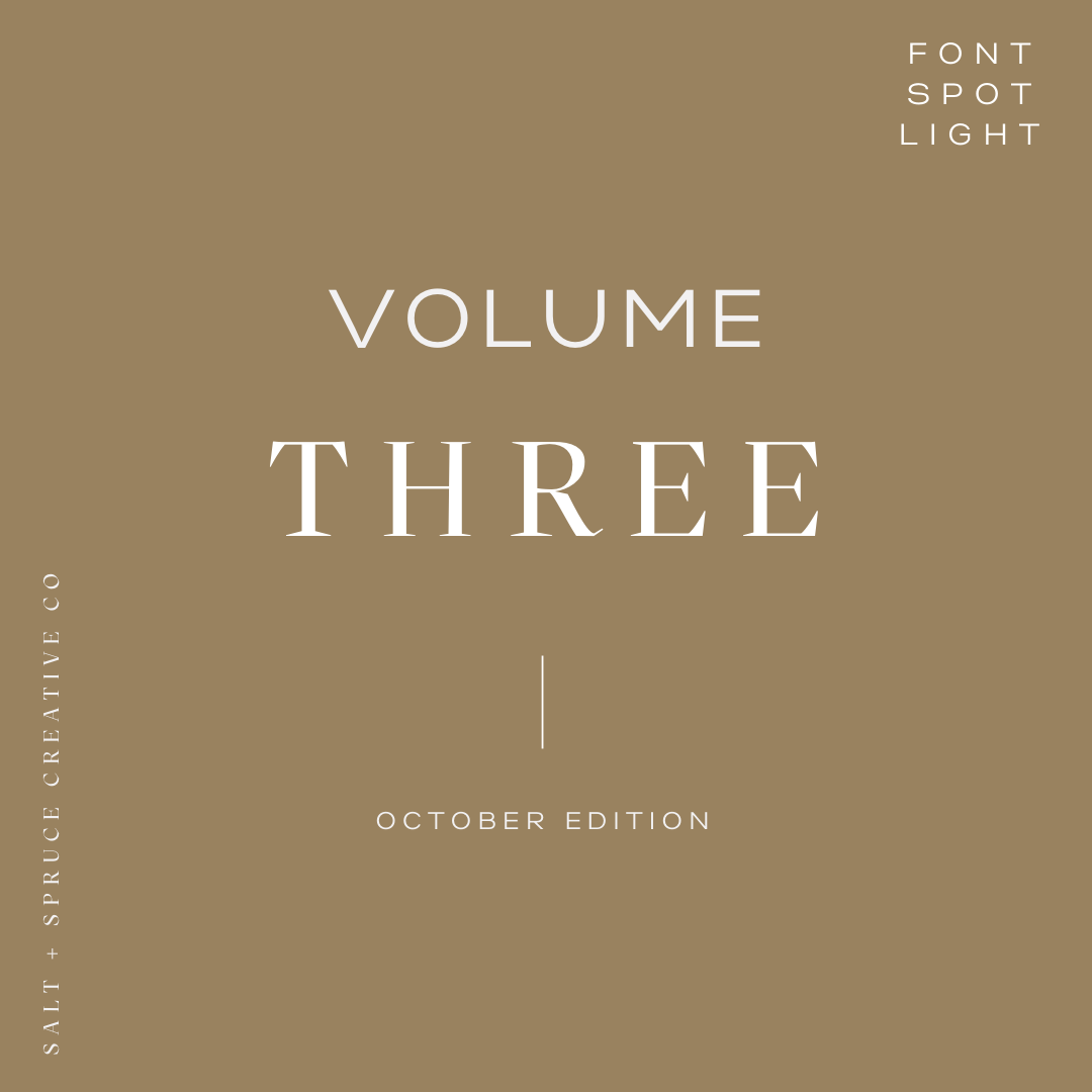
Volume 3 of our font spotlight series! I have always loved fonts and the way they can totally change the look of marketing material, logos, branding, etc.
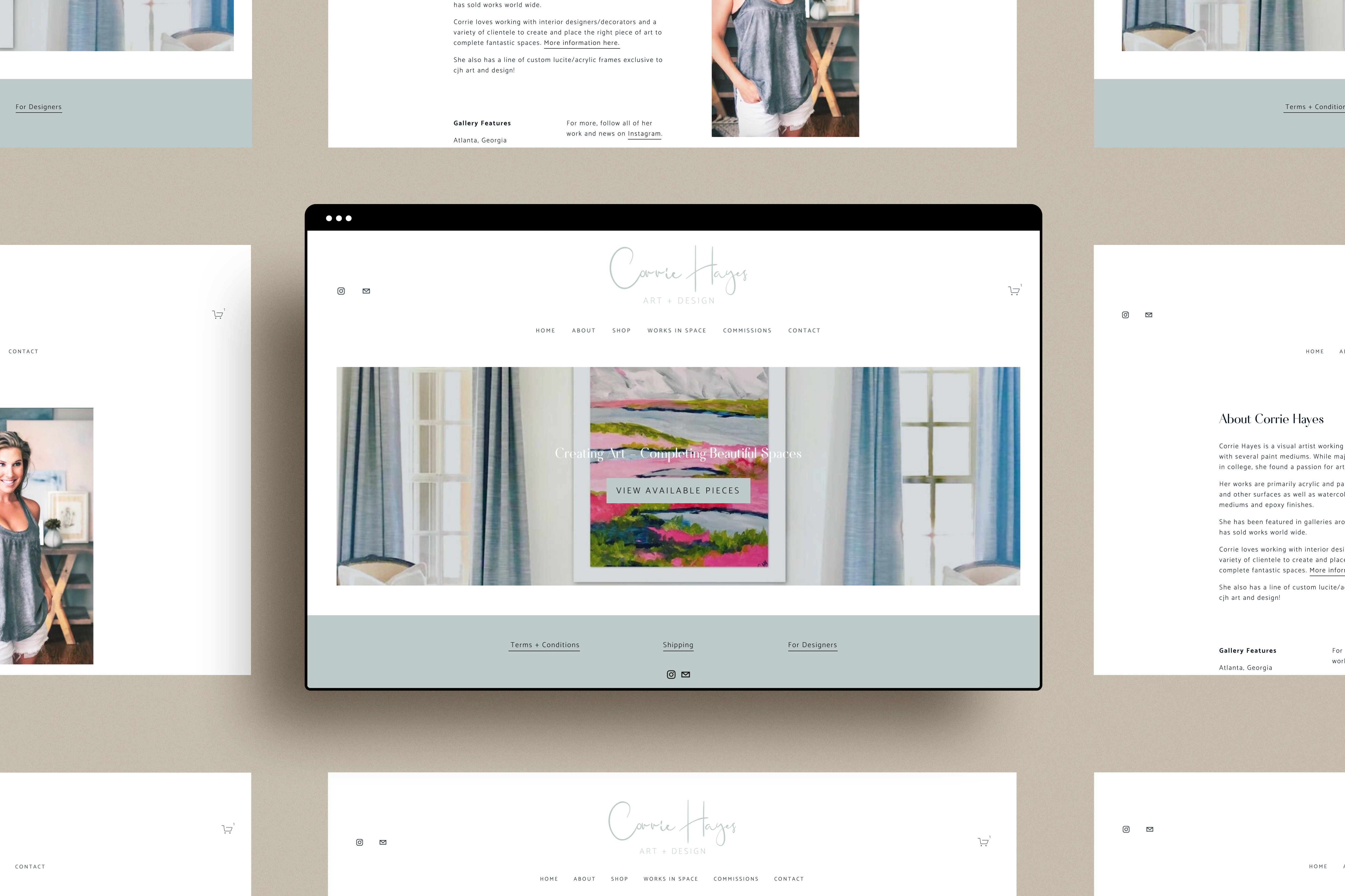
PROJECT OVERVIEW Website design for CJH Art + Design — an artist based in Birmingham, Alabama. INDUSTRY Artist WORK COMPLETED Website Design – Squarespace Color Palette
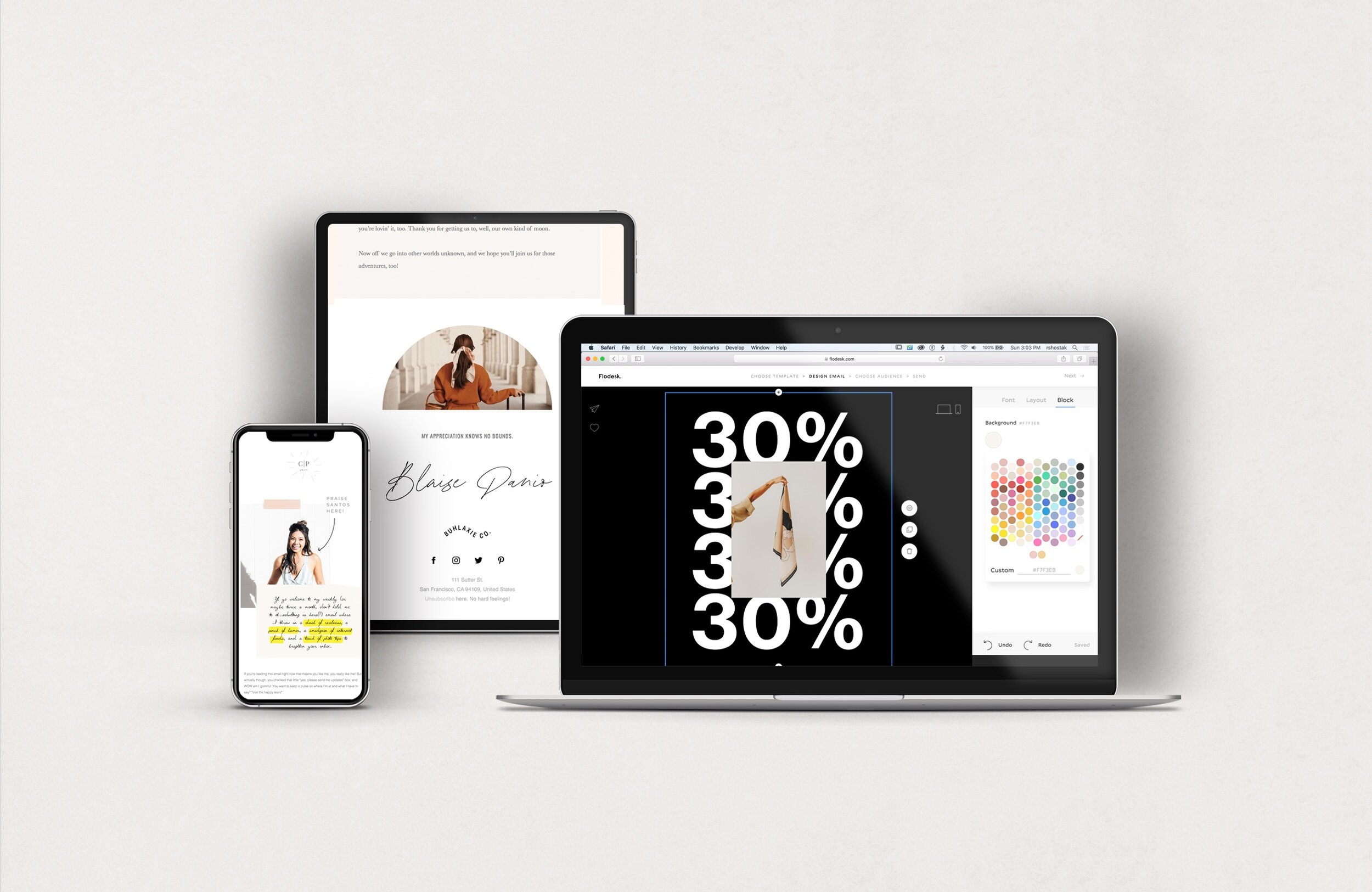
Being a small business that specializes in branding, I felt like my emails needed to sell myself. Who was I to preach about how important branding was when I couldn’t even send out an email that matched my brand?? Then I found Flodesk, and my investment was finally worth the money.
So why, Flodesk? Well, a couple of reasons!
Brand design for a motherhood journal featuring maternity, newborn, family, and event photography.
explore the
journal

View Posts
View Posts
View Posts
View Posts
View Posts