Some projects start with a brand that needs rethinking. Avenue Kosher started with one that already worked.
Avenue K has been catering kosher events across metro Atlanta since 1984. Their AKC-certified glatt kosher kitchen operates under the supervision of the Atlanta Kashruth Commission, and the team brings the same care to a Kiddush luncheon as to a 500-guest wedding.
Their identity was established and considered. The website was the part that hadn’t caught up.
Starting point
The old site was built on WordPress, with minimal text content as well as outdated photography. Updating was next to impossible for their team, the inquiry form was known to break, and nothing was optimized.
The brand had a clear point of view. The website was diluting it.
The challenge
When a brand is already strong, the website’s job changes. It doesn’t need to introduce a new identity. It needs to carry the existing one into a digital space without losing anything along the way.
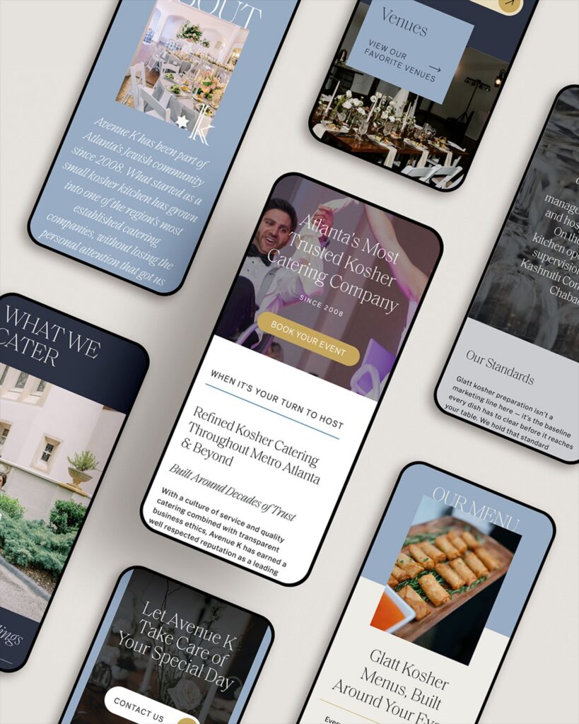
That’s harder than it sounds. A brand guide shows how a logo, palette, and type system look on a page. It doesn’t show how they behave across a homepage, a services page, a mobile menu, and an inquiry form. Each of those decisions either reinforces the brand or quietly weakens it.
Direction
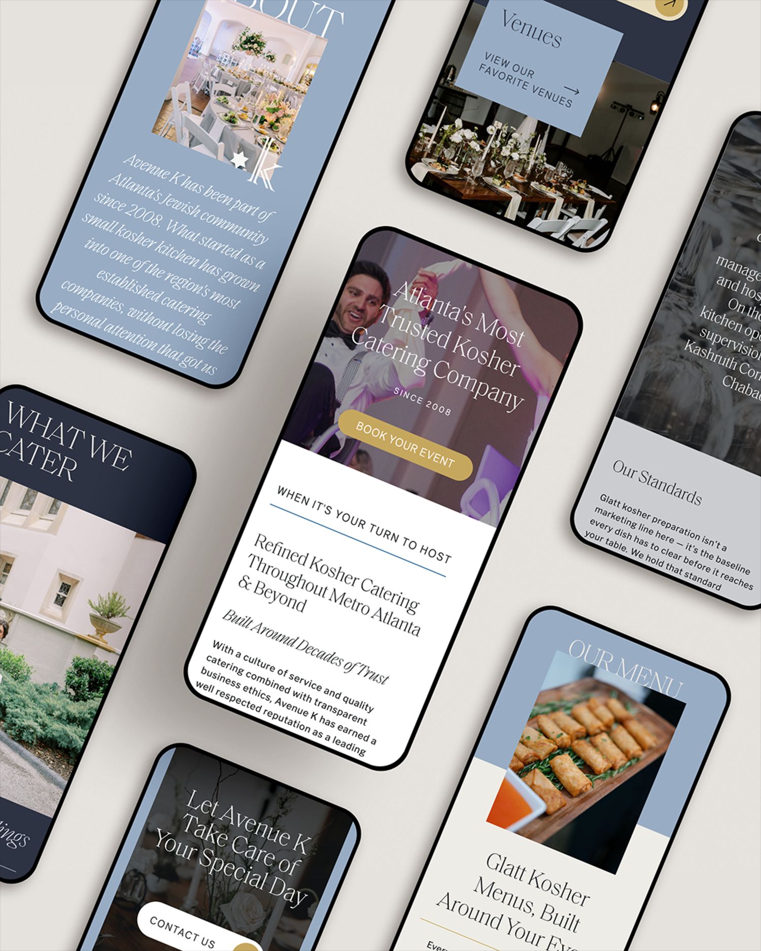
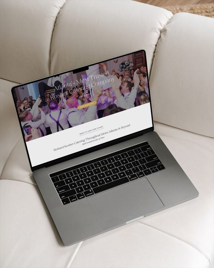
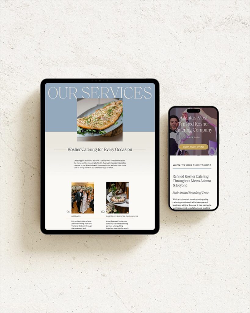
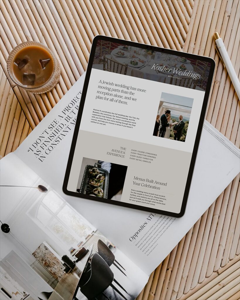
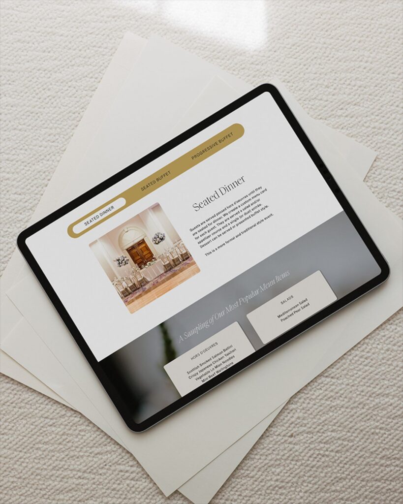
We built Avenue K’s site in Showit, designing around their identity instead of a template’s defaults.
We started with the people who use the site. Someone planning a kosher event in Atlanta usually arrives with one occasion in mind: a wedding, a bar or bat mitzvah, a corporate lunch. They want to know quickly that Avenue K handles that kind of event, and handles it well.
So the site is organized by occasion. Weddings, bar and bat mitzvahs, social events, and corporate events each have their own page, written for that event and the questions that come with it. A visitor gets to what’s relevant sooner, and each page has a clear chance of being found by someone searching for that specific event.
The second decision was about protecting what already worked. Avenue K has been catering for four decades, and Google had been sending people to their old pages for years. We kept the existing page addresses wherever we could and redirected the rest, so the new site launched with that search history intact.
What we left out mattered too. Over time, the old site had collected pages that no longer served the business, and we let those go. Every page that remains has a job.
Every layout decision came back to one question: what does their visitor need to see and understand before reaching out?
Result
The new site went live this fall, and the biggest difference for the Avenue K team is ownership. Their old site was hard to update, so it rarely was. Now they can change a menu item, swap a photo, or add a venue themselves, with training videos to walk them through it.
The inquiry form, which used to break, now works the way it should. A family planning a wedding or a company booking a lunch can reach the team on the first try.
Every page also has its own search title and description, written around kosher catering in Atlanta and the events Avenue K serves. The site has a far better chance of reaching people who haven’t heard of them yet.
What this project reinforced
A strong brand makes website design easier in one way and more demanding in another. The direction is already set, which removes a lot of guesswork. But there’s less room for choices that don’t fit, because the brand makes them obvious.
The best thing a website can do for a brand that’s already right is stay out of its way.

+ view the comments